wearehere! Campaign
Taking up space.
The design industry today still struggles with gender diversity. Despite progress made in recent years, there remains a significant gender gap in the industry, particularly at the executive and leadership levels. Women are often underrepresented in design schools and face barriers to career advancement, including pay inequality and discrimination.
wearehere! is a predominantly digital campaign that aims to raise awareness about women creators and draw attention to the gender gap in the design industry. It strives to expand the network of women creatives while promoting the employment of more women in design studios and encouraging women to pursue design as a career.
Naming the movement
The name "wearehere" serves as both a call to action and a reminder to the design industry and society as a whole of the presence and contributions of women creatives in this space. It also serves as a beacon of hope and reminder to women that they are not alone and that a supportive community of female creatives exists.
The varied typography in "are" symbolizes the diversity of talent and mediums utilized by women in their creative pursuits. Furthermore, the compressed placement of the letters represents the perseverance and determination of women as they strive to assert their presence in the industry despite obstacles and biases.
Crafting an identity for impactful and playful branding
The campaign aimed to capture attention while maintaining a playful tone, thus the brand identity needed to reflect wearehere's values of inclusivity, vibrancy, confidence, and excitement.
The design system therefore employs a bright color palette, geometric shapes, and striking graphics, resulting in a powerful, inviting, and memorable visual representation.
Abstract ideas made visual and captivating
Discussions around diversity can often be uncomfortable and lead to avoidance. In an effort to normalize these conversations and shift the focus away from solely discussing issues, wearehere sought to foster an environment where creativity, ideas, and lighthearted banter are also encouraged.
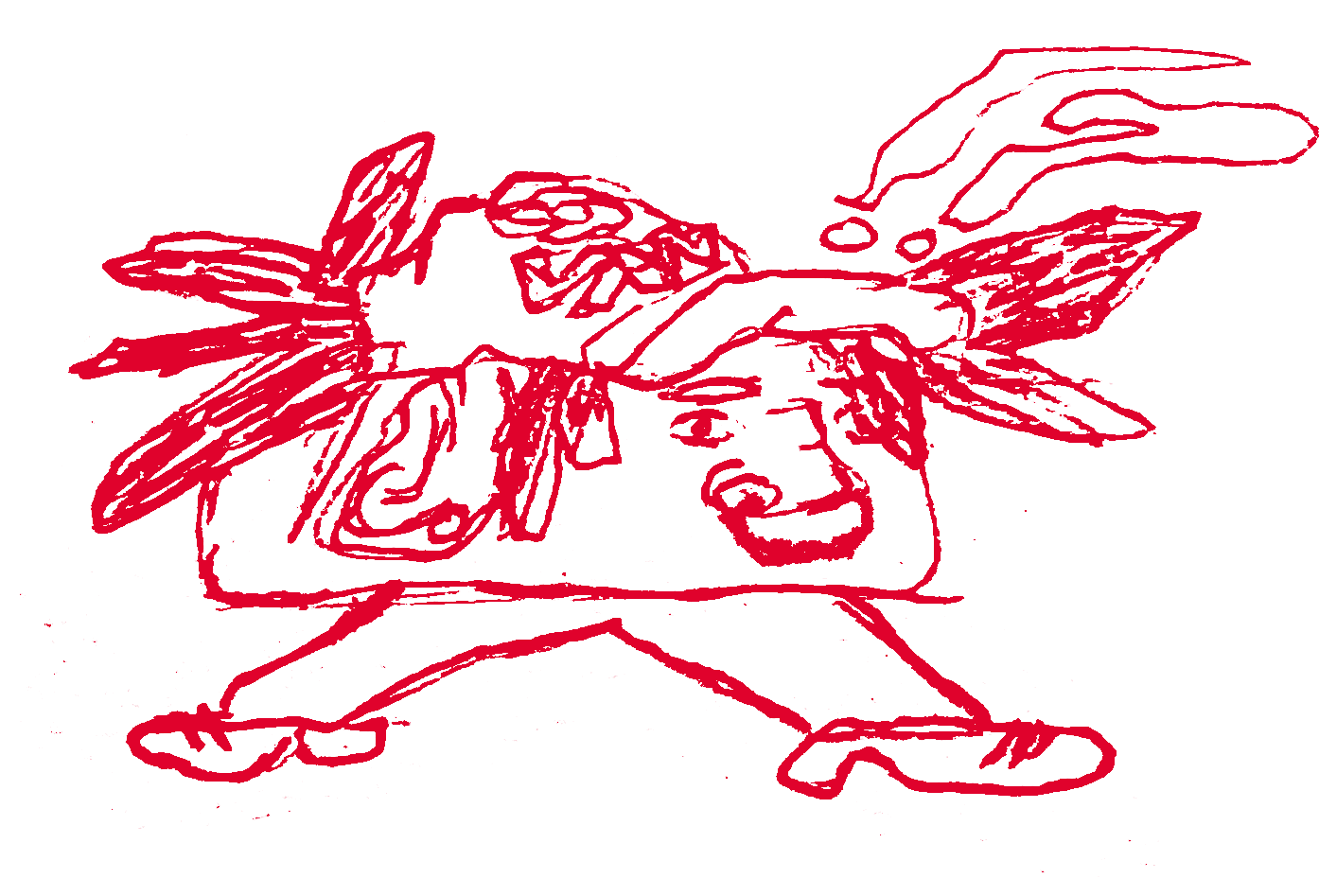
To achieve this goal, wearehere developed recognizable and open-to-interpretation illustrations that embody the campaign's personality, vision, and values. These illustrations also serve as conversation starters, facilitating dialogue around growth, creativity, playfulness, and other themes that align with the campaign's mission.
Embodying boldness
The primary and exclusive use of the sans-serif font "Degular" gives the campaign a strong and clear visual identity, while still maintaining an inviting and approachable tone. This font seamlessly integrates with the overall design style and encapsulates the ideas and essence of the campaign.
The unique type styles are thoughtfully incorporated across various mediums, including the wordmark, website, and social media platforms, to ensure consistency and establish a strong brand identity.
Credits
Images from unsplash.com


